I Made Some Changes
I’ve been working a lot on this site so I can apply the things I learn on projects I get paid to do. I’ve learned a lot the past few weeks and I’ve made some significant changes.
The biggest change is I switched from Jekyll to Eleventy. There’s nothing wrong with Jekyll. I’ve been using it for about five years and will continue to use it on a bunch of projects. That said, I love Eleventy.
Making the switch wasn’t too bad. It’s similar to Jekyll in many ways. It took me two Sundays. (Sundays are my coding for myself days and Saturdays are my working in the shop on things with motors days.) I take things slow when I’m learning something new. I read all the documentation, experiment and break things, and try to do the same thing but smarter.
I don’t have a lot to say about it right now. I’m still processing it all. I’ll go into more detail another time.
Web Fonts
I did some work on the web fonts. I was using Gimlet Text and Gimlet Display Narrow—a total of eight fonts. Now I’m only using Gimlet Text, which is four fonts total: regular, italic, bold, bold italic. I’m using the complete character set (I love the № character) and the OpenType features are turned on (gotta have small caps) so the files are a bit large. Now with only one typeface with four fonts, things are a bit faster.
I noticed I was getting the dreaded FOIT (Flash of Invisible Text). FOIT is when the text isn’t shown until the fonts load or the browser timeouts. Some browsers timeout sooner than others. It’d be fine for a type foundry website where the content doesn’t make sense without the fonts loaded, but in most cases it’s not a good idea. I’m sure some brand managers and art directors would disagree. In my opinion, if you can’t see the content immediately, you have no content. I and many others think FOUT (Flash of Unstyled Text) is better. FOUT is when the text is shown but isn’t in the font it should be.
I’m using Typekit… I mean Adobe Fonts. If I was self-hosting the fonts I could add font-display: swap to @font-face to solve the problem. Although, that doesn’t work in IE anything at the moment. There are a few ways to solve the problem. I picked Font Face Observer which allows me to not only avoid FOIT, but also apply styles to the text while the fonts are loading and if they don’t load. This can also help mitigate a sudden shift and the text reflows when the font loads. For example, Georgia with a font size of 1.2rem and a line height of 1.1 is close to Gimlet with a font size of 1rem with a line height 1.3. I’m making that up because I haven’t worked on that part yet.
I had a hard time understanding Font Face Observer when I first discovered it. After some research and experimenting I get it now, but not enough to explain it well. For that, Webfont Handbook by Bram Stein is a great source. He also made Font Face Observer. Another good book is Flexible Typesetting by Tim Brown. I've read both of those books a least twice and refer to them often. And, yes, I’m a big fan of A Book Apart.
The next step, in addition to matching Gimlet with a fallback style, is to test self-hosting. I got a testing license for Gimlet and I’m going to, well, test it. If all goes well I’ll buy a license. I probably will anyway because, and I could be wrong, I think type designers make a little bit more when you buy fonts directly from them. Designing a typeface is a lot of work and people should be paid for their hard work.
Other Changes
I removed analytics from this site. I never looked at the data anyway. Someday I may use something that has better privacy, like Netlify Analytics, but that costs money and I don’t have a lot to spend. This site doesn’t get much traffic and even if it did I don’t know what I’d do with that information. I like to pretend I’m the only one who visits this site.
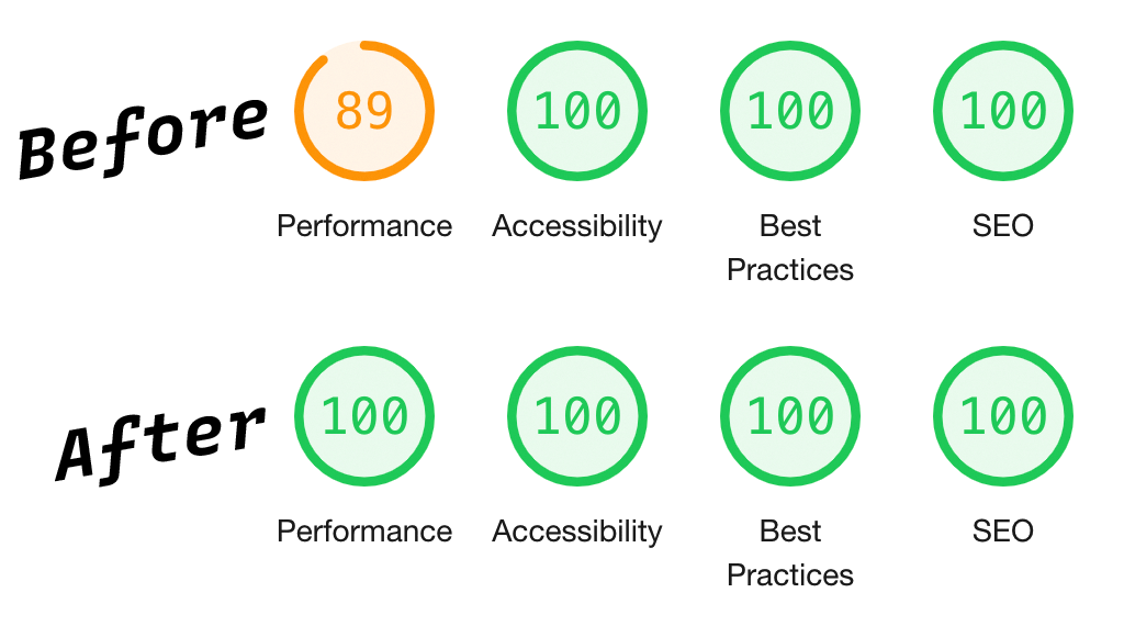
To wrap this up I’ll leave you with a screenshot from Lighthouse of my website’s performance before and after I made the changes. Does it mean anything? I don’t know, but it makes me feel like I accomplished something.
